Buttons sketch file is composed of three sections :
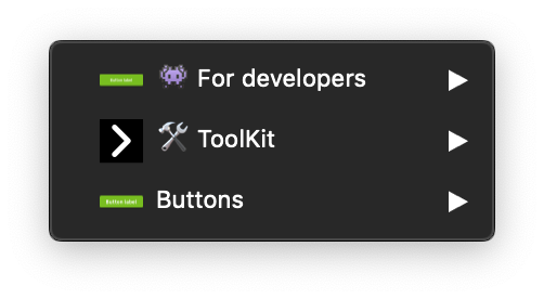
👾 For developers :
This part is a specific section for developers, for a better accessibility there is all states of the Mozaic buttons :
- default
- :active
- :hover
- :focus
- :disable
- :hover:focus
🛠 ToolKit :
The ToolKit section bring together the dedicated symbols used for building the final symbols, and you can find them in the symbol overrides.
Never use the toolkit symbols in your project.
Buttons :
Here is the ready-to-use symbols for your projects, you can find all the buttons with all the possible variations :
- Small size, medium size or large size
- Primary, primary-02, neutral, danger or disable
- Solid or bordered
- With or without icons
- etc...